1/13/25 - thumbnail design for musicians/remixers
i've seen many a remixer make something cool, yet only get a few hundred views usually due to a subpar thumbnail. it's a bit unfortunate really, because i feel like you shouldn't have to be forced to learn graphic design just because you have an interest in video game remixes. that said, it doesn't really matter what gripes i have with the system because it's not getting changed any time soon. the best i can do is share the knowledge i've accrued over the past ~3.5 years. hopefully this helps whoever happens to come accross it.
0: HOW DO YOU IMPROVE AT ANYTHING?
i think just about the best thing you can do to improve at really just about anything is study what you like and try to recreate it. study videos that have done well, especially videos with thumbnails you like, and double especially videos that are remixing the same song you are, and think about what makes them good. obviously you don't have to recreate it exactly, since there will likely be assets you don't have access to, but try to make something that captures roughly the same feel. also don't copy too hard if you actually plan on using the thumbnail; it's fine for practice, but plagiarism is kinda cringe.
now, let's get into some less generic tips:
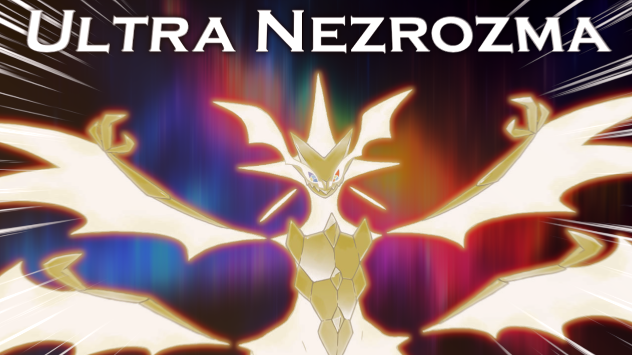
1: FACES ARE KEY.
the number 1 tip for a reason. especially true if it's the face of a recognizable and/or popular character. if possible, try to focus on/zoom in a bit on the face.
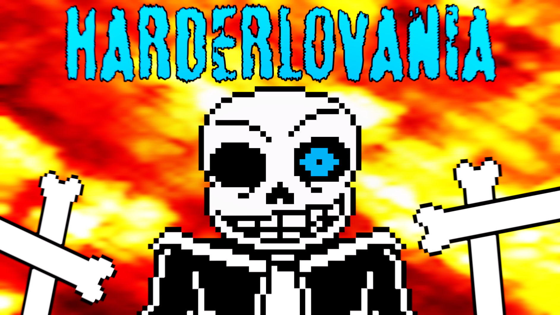
BAD:
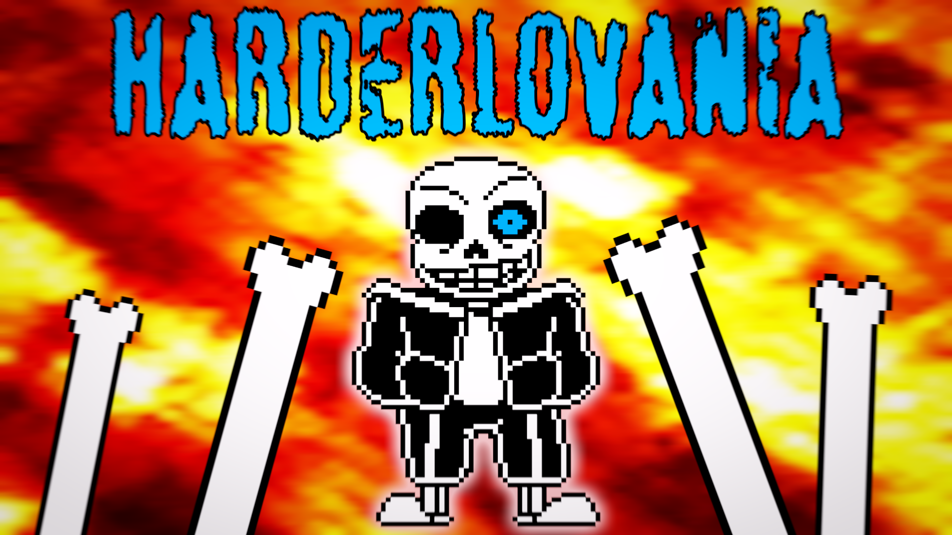
BETTER:
but let's say you're not remixing a character theme. maybe you're remixing something like the route 47 theme from pokemon hgss. my point still stands. showing recognizable characters is the best route.
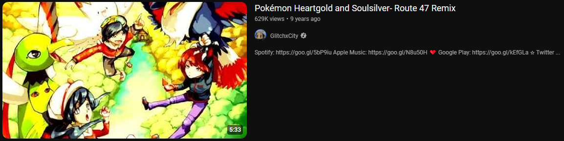
^ take a look at this. the thumbnail shows a fun piece of fanart by sa-dui on deviantart. it communicates that the video has to do with gen 2 pokemon, but more importantly, it's just a good piece of art that is likely to grab a viewers attention. the colors and quality are a bit messed up, but it still worked because youtube was a different place in 2015 i guess lol.
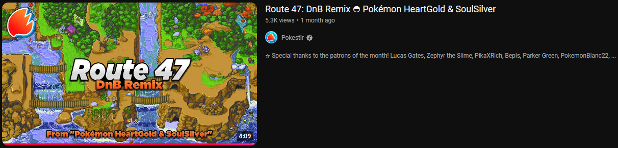
now take a look at this. no shade to pokestir, in fact i listened to this and it's a pretty great remix, but while you might think that showing a screenshot of route 47 would communicate that that's what this video is about, it's a bit redundant when your title and thumbnail text already say that it's a remix of the route 47 theme. plus, while a screenshot of route 47 might be recognizable to some who have played the game enough to know it by heart, it's not as recognizable nor emotion-inducing as the actual characters. whenever i see the top thumbnail, i think "oh wow, that's some cute fanart, i bet the song quality matches the art quality," while when i see the bottom thumbnail i just think "oh, this is a remix of the route 47 theme. alright then." the top thumbnail was able to hook me better despite me not even having played hgss. (i played gs like 9 years ago but that's besides the point.) now, i still clicked on the bottom one because i'm used to smaller remixers not having the thumbnail quality and music quality align, but understand that i'm not an average youtube viewer. the average youtube viewer prefers the top one, as proven by their view counts.
ok, that was lot. here's even more:
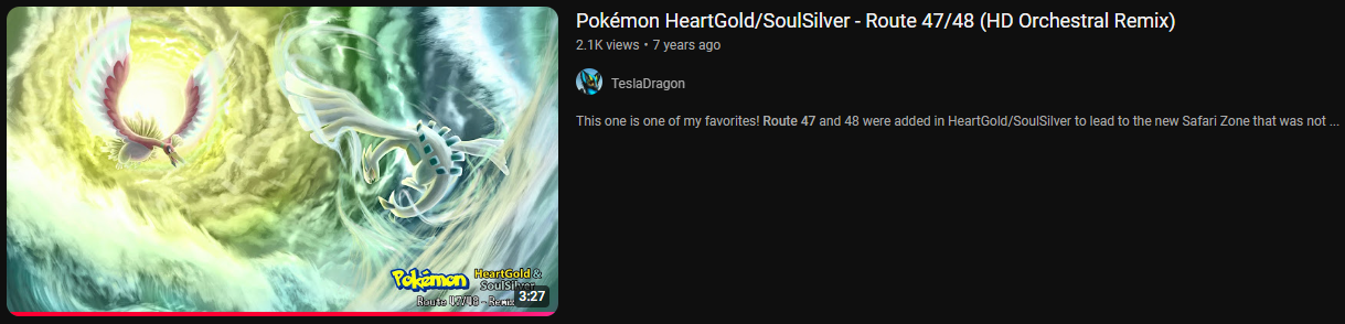
on first glance, this seems to meet our checklist. it's got cool fanart of recognizable characters from the game the remix is about. it's even had seven years to grow, so how come it only has 2.1k views? well, my first thought is that it's not focused enough on the characters. there's a lot of dead space on the left, right, and bottom sides. it could've been zoomed in a bit more to focus on lugia and ho-oh. second, the epic fight taking place in the clouds here doesn't really align with this being a remix of a random route theme. i think something a bit cuter could've fit better here. also, the text is so small you can barely even read it, plus it's being covered up by the timestamp. honestly it'd probably be best to just not have text here at all. sometimes it's best to just let the title and the art speak for itself.
ok, i promise i'm almost done. just a little more.
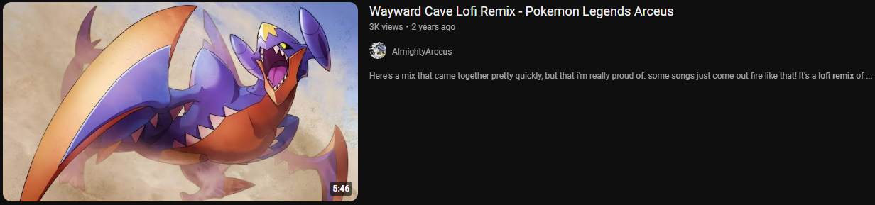
again, this seems to meet our checklist. cool pokemon art, no dead space, no unnecessary clutter... what's going on? why only 3k views? well, this is where we start to diverge a little bit from the actual topic of this post. the only problem i could see with this thumbnail is that it doesn't really make sense for a lofi song, though i'm less sure on this than i was with the other videos. the only other things i can think of have nothing to do with this specific thumbnail. first, the title could've been better. maybe some fancy unicode characters would've helped to sell the lofi •.¸¸.•` 𝚊𝚎𝚜𝚝𝚑𝚎𝚝𝚒𝚌 `•.¸¸.• . beyond that, it really just comes down to having more consistently good thumbnails like this. a lot of arceus' other thumbnails either don't make sense for the aesthetic of the song, don't focus on characters enough/have a lot of dead space, or both. this leads to their channel not having a lot of returning viewers - something absolutely vital for having a successful channel, even more important than subscribers in fact, though that isn't saying much because subscribers don't actually mean anything. most people don't even use the sub box these days, and having more subs doesn't make you more likely to get recommended, so it's mostly just a vanity metric these days. if arceus had more returning viewers, this may have been more likely to get more views, but also maybe not. the vgm remixing scene is a lot more saturated than it was 9-12 years ago, and nowadays it seems like every classic pokemon song already has a good remix with over 100k views on it, making standing out amongst the competition that much harder.
ok, i promise the rest of the points won't be that absurdly in-depth. let's move on.
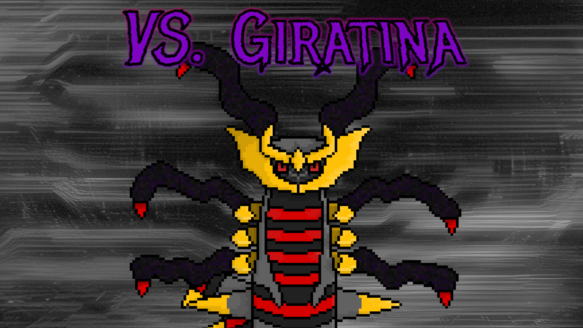
2: AVOID REPEAT INFORMATION.
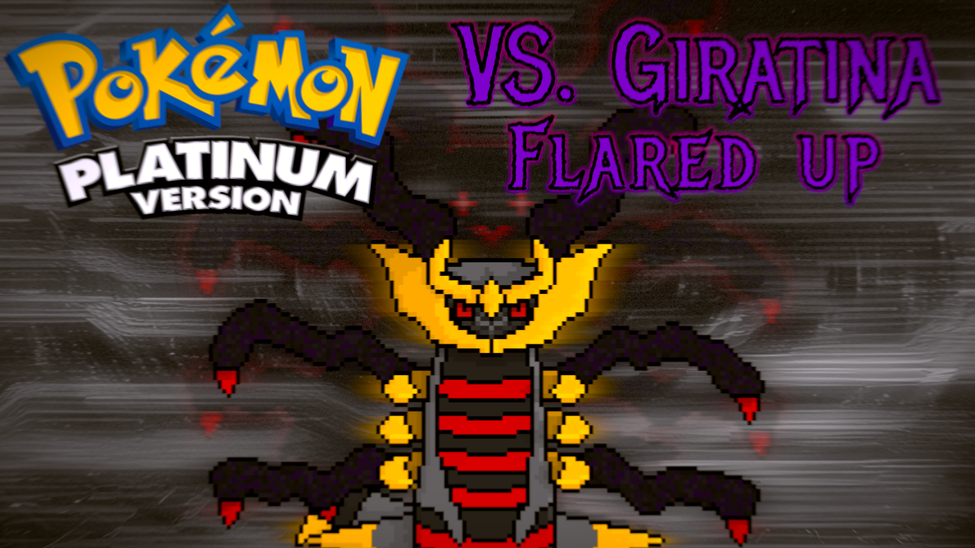
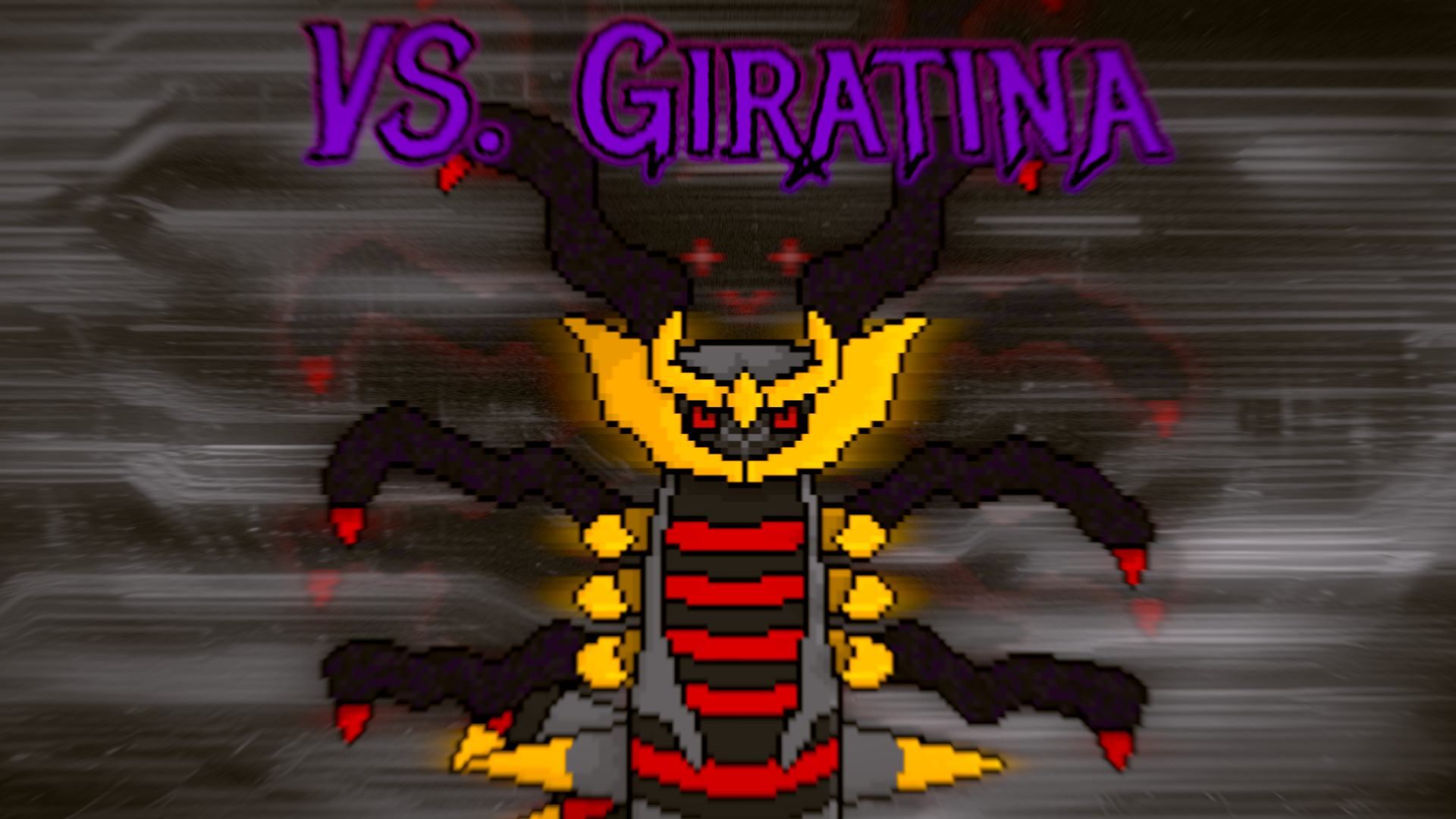
try not to just say the title again in your thumbnail. for example, if your title is "Pokemon Platinum: Vs. Giratina (Flared up)," you don't need to add a bunch of text that just repeats that. as far as text goes, just the name of the song is almost always enough.
BAD:
BETTER:
3: SMALL DETAILS MATTER.
do things like look for cool fonts, add a slight zoom blur (if it fits), try a cool abstract background - whether it be made with a program like OBS, taken from a stock photo online, or generated with AI - or add a little glow. most importantly, never ever underestimate the power of color correction. it can be the difference between your thumbnail looking alright and really popping. also, since i'm probably not going to be able to say this anywhere else, be sure to crank the contrast up really high. i heard smallant say you should so it must be true! (ok but actually it is pretty important).
BAD:
BETTER:
4: TEACH COLOUR THEORY (BREATH THE AIR).
god i hope someone gets that reference. anyway, even just looking at a color wheel while making your thumbnail can help to make your thumbnail more aesthetically pleasing. also, apparently yellow has been scientifically proven to be the most attention grabbing color, so take that as you will.
5: VISUALIZE YOUR SONG IN YOUR THUMBNAIL.
this sort of ties back into what i was saying in tip 0 with studying other thumbnails, but try and think about the aesthetic your song/video gives, and visualize that in your thumbnail. obviously this is pretty broad and subjective, but it's still worth thinking about. if your song is more intense, make sure whatever art you use fits, and maybe add a subtle zoom blur depending on the circumstances. if it's lofi, warm colors could help, and well as maybe a light background blur/diffuse.
6: THE TINY TEST.
a huge portion of youtube users use youtube on their phones, and, as such, thumbnails will be WAY smaller than what you see while you're making it on your computer. while you're making your thumbnail, zoom out a bunch to see if your thumbnail is still comprehensible, and if not, consider making some changes.
7: AVOID THE BOTTOM-RIGHT CORNER.
try not to put important information in the bottom-right corner. that's where the video timestamp appears, and it will make whatever you put down there impossible to see.
8: PREVIEW YOUR THUMBNAIL.
there's a pretty cool website called thumbnailpreview.com that lets you preview your thumbnail in a simulated youtube homepage. take full advantage of this to see how well your thumbnail and title stands out amongst everyone else, as well as to make sure the video timestamp doesn't obscure anything important.
9: MAKE MULTIPLE THUMBNAILS.
youtube has a feature that lets you test and compare up to 3 thumbnails at once to see which ones viewers prefer. TAKE FULL ADVANTAGE OF THIS!!! i can not stress enough how useful of a feature this is. more than once i've made 3 thumbnails for test and compare, thinking i knew which one was the best, and been proven wrong by the data. 3 thumbnails means 3 chances to win the algorithm over.
10: CHANGE OLD THUMBNAILS.
the best thing you can do to make an old video get more views is to change the title and thumbnail. (the second best thing you can do is have an end card on a video that's currently doing well lead to the video you want to get views).
COMMON MISTAKES:
1: "PowerPoint thumbnails."
a lot of thumbnails i've seen on smaller remixing channels look like PowerPoint slides. while this can look nice in isolation, it doesn't exactly work as an "eye-catching" thumbnail. an ideal thumbnail catches the viewer's attention; it gets them to stop scrolling, provokes intrigue, and captivates them into clicking your video. if your thumbnail looks like this, it looks kinda amateur and doesn't do a great job at communicating how good your music is (or maybe it does lmao idk who's reading this).
BAD:
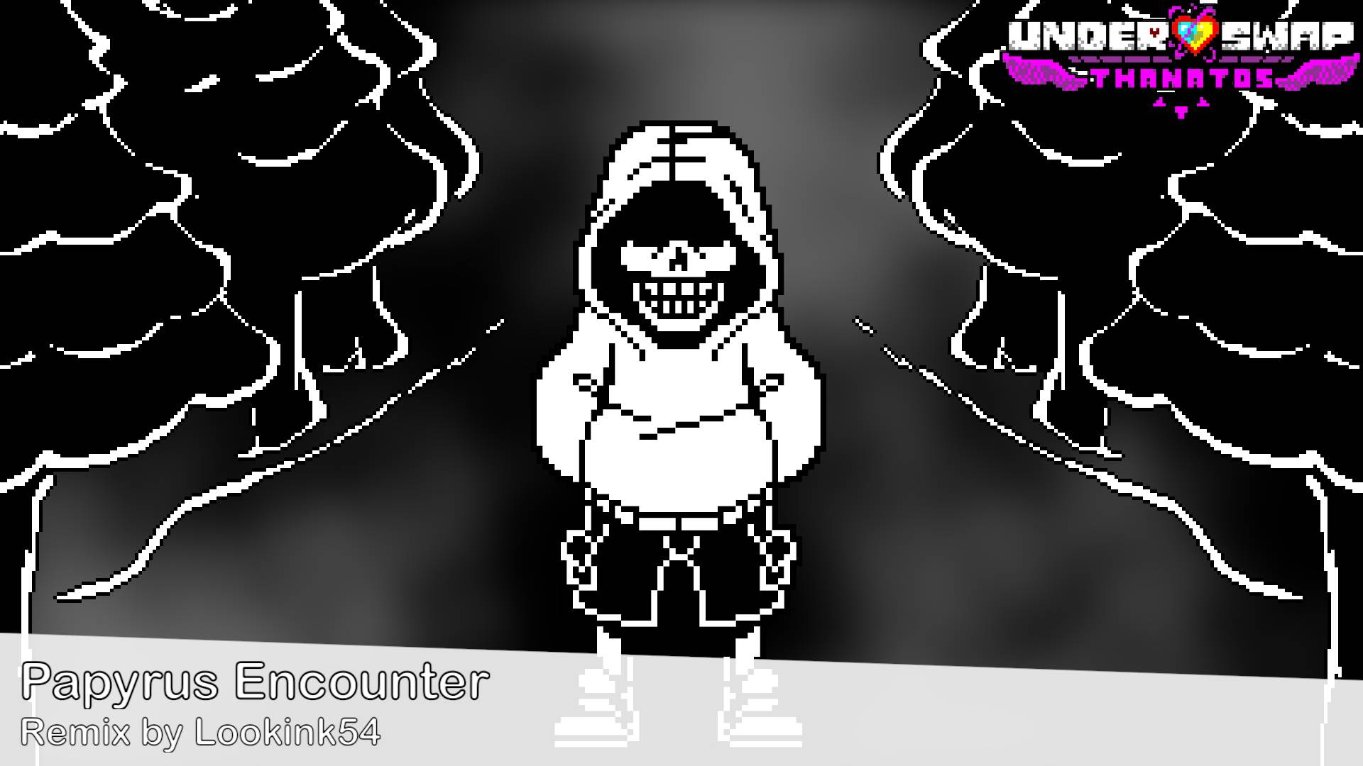
(credits to traxsus for the papyrus sprite and torva for the background of the papyrus encounter thumbnail).
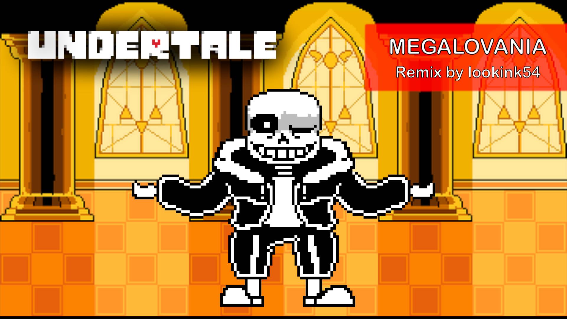
2: Using official art.
well, using official art isn't inherently bad, it just means you need to do something else to stand out. believe it or not, using art that everyone has seen before and is sometimes a bit bland doesn't help you to stand out amongst the huge crowd of vgm remixers. it's still possible to stand out with official art though, as proven by remixers like Vetrom, it's just a bit more difficult.
BAD:
BETTER:
CONCLUSION
at the end of the day, i'm just one guy giving advice that you don't have to follow. heck, you don't even have to make a thumbnail at all if you're just doing youtube for fun and don't care about views. that said, if you want this to become a source of income (or just want people to see and be inspired by your hard work), knowing how to make a good thumbnail is pretty necessary. should that be how it is? maybe not, though personally i find making thumbnails to be pretty fun. i suppose that's the most important thing at the end of the day. try to find value in the art of improving your craft, just as you would with music or whatever other artistic medium you may be interested in. no matter where you're at right now, there's still room to grow.